McDonalds Workplace
B2B
UX/UI
Internal Tool

Designing internal systems to onboard, manage and scale a global workplace platform
Year
2023
Services
Product Design (UX/UI), UX Research, Workshop Facilitation

Overview
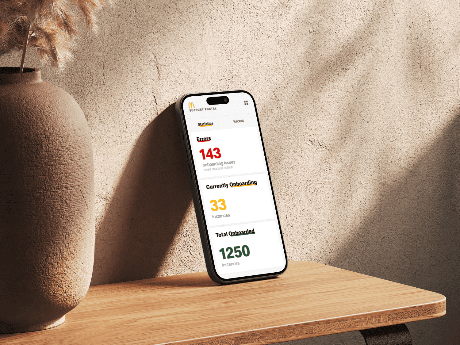
To support the rollout of McDonald’s Workplace engagement platform across regions, two internal tools were designed:
Support Portal for onboarding new instances and Administration Portal for managing instances, users, roles, and content across markets. These tools were used by internal administrators responsible for configuring and maintaining complex systems at scale.
Problem
Administrators needed to onboard instances, manage permissions, and control content across markets — all within strict business rules and security constraints. The existing experience was fragmented and difficult to reason about.
Small configuration errors could scale quickly and create operational risk.
Core question:
How do we help non-technical users confidently manage a complex global system without oversimplifying it?


My Role
I led the design process from discovery to delivery, working closely with product and engineering while fulfilling my responsibilities:
UX research and synthesis
workshop facilitation
defining workflows and information architecture
designing interaction patterns and system states
Research & Discovery
Research was iterative and grounded in real constraints. Methods included stakeholder interviews to understand rules and risks, user interviews with administrators across markets, personas and journey mapping to surface friction points, usability testing on early prototypes and qualitative analysis from feedback and observed usage.
Several clear patterns emerged throughout the discovery phase. Predictability proved more valuable than flexibility, especially in high-impact workflows, and preventing errors was more important than optimizing for speed. Administrators needed to understand the consequences of their actions before committing changes, while consistent patterns across views helped reduce cognitive load and increase confidence. These insights directly informed design decisions and iterations throughout the project.

Process
This project focused on turning ambiguity into structure. Rather than simplifying the system artificially, I worked on making its logic visible and predictable.
Clear separation between global and contextual actions helped users understand scope and impact, while progressive disclosure prevented advanced configuration from overwhelming the interface.
In data-heavy views, strong hierarchy and visual structure supported scanning and comparison. Inline validation reduced the likelihood of costly errors before submission, and explicit confirmations protected irreversible actions.
Reusable patterns across markets and instances ensured consistency at scale. The goal was never to hide complexity, but to make it understandable and trustworthy.


Outcome
While metrics are confidential, the redesigned portals resulted in faster instance onboarding, fewer configuration errors, reduced reliance on support and higher confidence among administrators.
The system also established a scalable foundation for future markets and features.
Reflection
This project reinforced that internal tools deserve the same UX rigor as customer-facing products, that clarity comes from structure, not simplification and also that constraints often guide the best design decisions.