Span Resolution
Redesign
ITSM
Usability Testing

A modernization of a legacy ITSM platform used internally by support teams. The challenge was to improve usability, structure, and clarity without disrupting complex existing workflows.
Year
2024
Services
System Redesign, Usability Testing, Implementation Collaboration
Overview
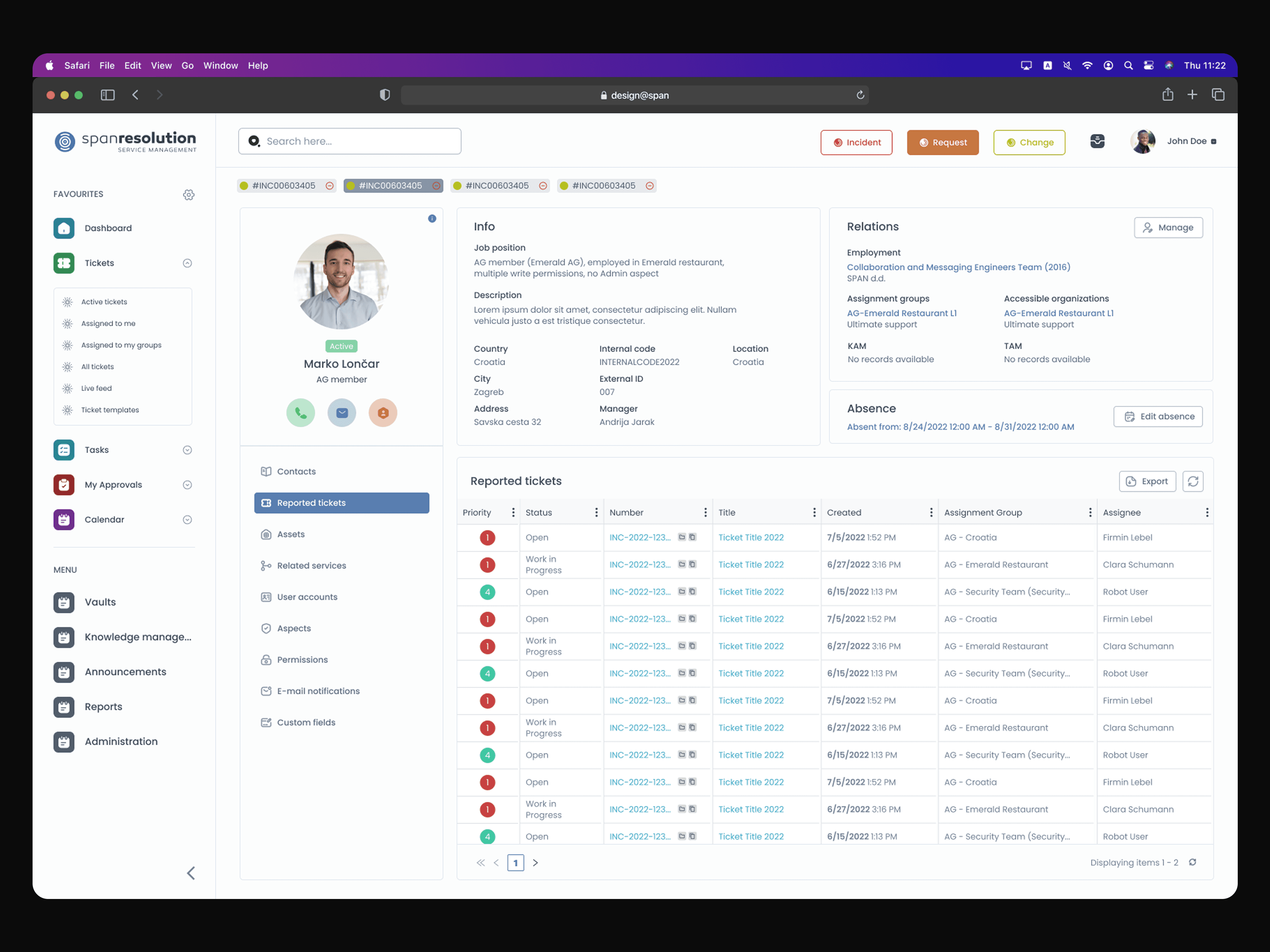
Resolution is an IT service management tool used daily by internal support teams to manage incidents, requests, and operational processes.
While functionally robust, the interface had evolved organically over time. Visual inconsistency, unclear hierarchy, and dense layouts made daily tasks slower and cognitively heavy.
This was not a simple UI refresh — it required understanding how support teams actually worked.
Problem
The tool had evolved over time into a functionally rich but visually fragmented system. Outdated interface patterns, overloaded screens and unclear hierarchy made everyday tasks more cognitively demanding than necessary. Interaction behavior was inconsistent across modules, which increased the learning curve for new team members and slowed experienced users. Despite its powerful capabilities, overall satisfaction was affected by friction and structural ambiguity. The central challenge became how to modernize a complex ITSM system without disrupting the workflows that teams relied on every day.
My Role
I led the redesign initiative from analysis through implementation, working closely with the internal support team and engineering while taking ownership of:
user interviews and structured surveys
workflow observation and task analysis
interface restructuring
high-fidelity prototyping and usability validation
front-end collaboration and HTML/CSS support
Research & Discovery
Understanding the operational workflow was critical. Through interviews with support agents, structured surveys, workflow observation and competitive benchmarking, clear patterns emerged. The primary issue wasn’t functionality but structural inconsistency and excessive cognitive load.
Support agents worked under time pressure and context switching. Dense layouts and unclear hierarchy increased mental load. Many actions required excessive scanning or guesswork. Predictable structure and improved visibility of system states were more valuable than adding new functionality.

Process
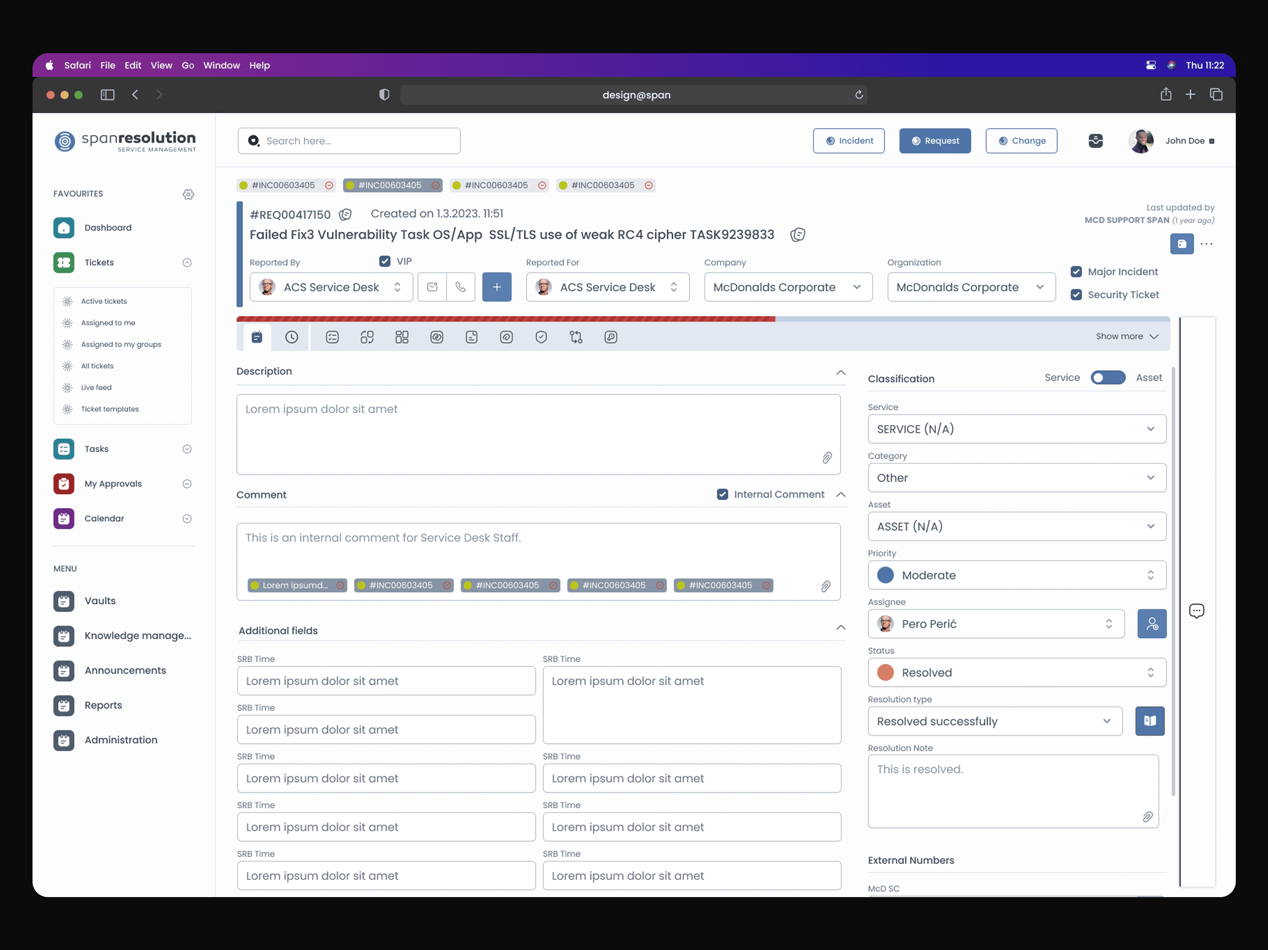
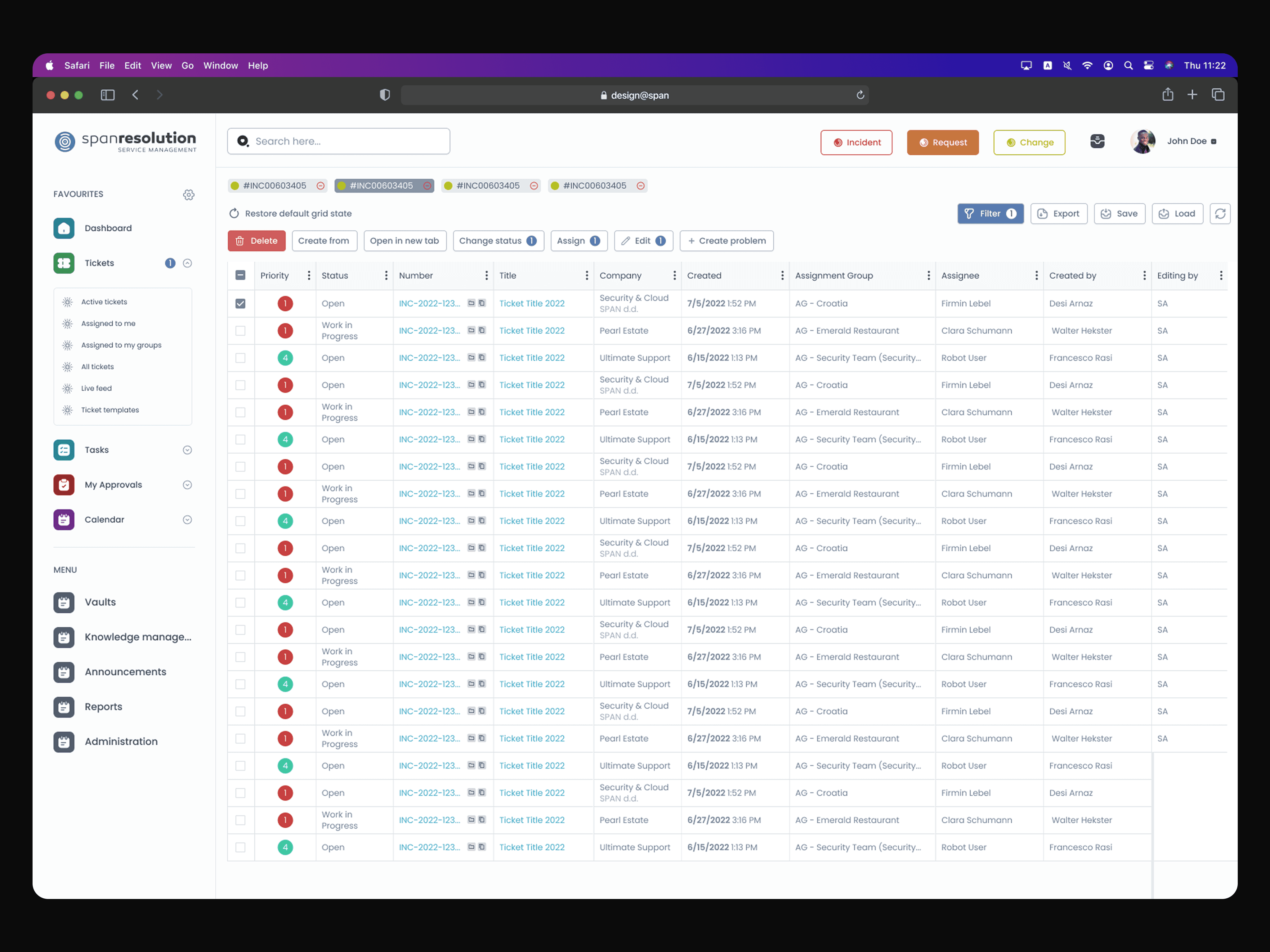
The redesign focused on restructuring rather than reinventing. Rather than stripping features away, I worked on clarifying and organizing the system so it felt predictable and easier to navigate. Layouts were reorganized to prioritize critical actions and reduce unnecessary visual noise, while visual hierarchy in data-heavy screens was strengthened to support faster scanning and comparison. Interaction patterns were standardized across modules to improve consistency and system states were refined to make status and impact more visible at a glance.
A high-fidelity prototype was developed and tested with support team members to validate improvements in task completion speed, navigation efficiency, clarity of system states and error prevention. Feedback from these sessions directly informed iterative refinements before implementation.
The redesign was rolled out incrementally to minimize disruption to daily operations. I collaborated closely with front-end colleagues, supporting HTML/CSS implementation to ensure the design translated accurately into production. Continuous monitoring of user feedback and usage patterns informed further adjustments, allowing the system to evolve without destabilizing existing workflows.

Outcome
The updated interface improved task clarity and navigation speed while significantly reducing cognitive load for support agents. Users reported a more intuitive experience, with clearer system states and more predictable interactions. Importantly, the redesign preserved the tool’s functional depth while making it substantially more usable and visually consistent.
Reflection
This project reinforced that modernization is not about aesthetics — it’s about structure and respect for existing workflows.
Designing within a legacy system requires careful balance: improving clarity without destabilizing what users depend on.

